
6 Mistakes to Avoid When Writing an eLearning Storyboard
Shauna Carson
A movie producer doesn't show up on the first day of shooting without having completed several planning activities. A script is written, casting is completed, and a storyboard is written and approved. Similarly, when you set out to create an online course, the more planning ahead you can do, the better. Figuring out exactly what you want learners to learn and what each screen will look like saves development time and money. However, writing an effective eLearning storyboard isn't an easy task.
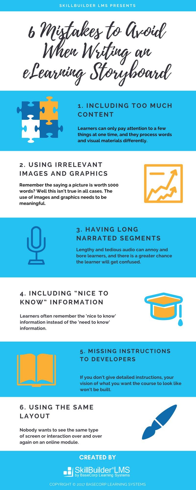
This blog post identifies the six most common storyboarding mistakes and provides tips for improving your eLearning. An eLearning infographic is also available that summarizes the things that you should avoid when writing a storyboard.
What is a storyboard?
A storyboard is a paper-based text and graphic representation of what your eLearning course will look like. It allows you to visualize how different screens, text, animation, graphics and assessment questions fit together before you've programmed a single screen.
A good storyboard is helpful in communicating your ideas to your customer, allows you to show your development team what you have in mind, and saves you from trying to convey what you want with wordy explanations and frustrated hand gestures.
Because storyboarding is probably the most important part of the development phase, it is a key skill that all instructional designers must master.
Mistake #1: Including too much content on each screen
Recent cognitive psychology research outlines some learning limitations instruction designers should bear in mind.
For meaningful learning to occur (knowledge is transferred to a different situation, or, in our case, into the workplace), certain cognitive processes must occur. These processes are often hampered both by the fact that learners can only pay attention to a few things at one time, and they process words and visual materials differently.
Keeping this in mind, screens that feature graphics, text, animation, etc. are difficult for learners to digest.
Instead, consider appropriate use of white space. According to Karla Gutierrez, "an abundance of white space in the right locations on a screen is crucial to build eLearning courses that deliver".
You should also consider breaking long strings of content into bite-sized pieces. It's better to deliver content to learners in short and focused learning nuggets because it enables learners to achieve their learning goals faster and transfer their new skills more effectively into the workplace.
Other tips include:
- Use bullet points where appropriate
- Use graphics, icons and subheadings to break up text
- Mix up the styles with downloadable guides and job aids; not all of your content has to be on the screen
Mistake #2: Using irrelevant images and graphics
Remember the saying a picture is worth 1000 words? Well this isn't true in all cases.
The use of images and graphics needs to be meaningful. A graphic shouldn't be included in a storyboard because the template indicates that there should be one. Rather, the image should link to the content in a way that the learner can digest the information quickly. For example, if the onscreen content is related to kids' sun safety, your graphic should be of children playing in the sun and not of adults sunbathing.
In multimedia learning, spatial contiguity is a term used to describe how people learn more deeply when corresponding printed words and graphics are placed near rather than far from each other on the screen.
This research shows that it is better to have the text in the graphic itself or integrate the words into the graphic than have separate text and graphics on a screen. For example, if your screen talks about the different parts of the brain, it's better to label the parts directly on the image, rather than using a legend and labelling parts a, b, c and so forth.
Mistake #3: Having long narrated segments
Using audio is an effective way to enhance your eLearning course as it can increase engagement. However, if used ineffectively, audio can also depress learning. Lengthy and tedious audio can annoy and bore learners, and there is a greater chance the learner will get confused.
Present the material in parts. People learn more deeply when a narrated animation is presented in learner-paced segments rather than a continuous unit. For example, present the first step, then have learners press continue to move to the next step. Giving people control over the pacing of the presentation has a huge effect on transfer.
It's a best practice to let the audio drive the page, while key text and related graphics support the message. But remember, your audio should not exactly match the on-screen text.
Good audio narration should be simple and short. Priyanka Dhondi outlines 4 additional tips on how to make effective use of audio in eLearning including:
- Use a conversational tone
- Use a professional voice
- Use more than one audio character
- Avoid 'shhh' and 'umm' sounds
Mistake #4: Including "nice to know" information
Research shows that people learn more deeply when extraneous material is excluded rather than included.
As instructional designers, we often include graphics or information that is "nice to know" information but isn't exactly what the learner needs to learn. Research shows that in these situations, the learner will remember the 'nice to know' information instead of the 'need to know' information. Your job as an instructional designer is to sift through the content and separate out the most important pieces.
In Diane Elkin's blog post Negotiating Out "Nice-to-know' Information, she identifies ways to parse out pertinent information from an SME meeting. Most importantly, she suggests that just because the "SME says so", doesn't mean it's necessary content to include in your storyboard.
You are the instructional designer and your job is to work with your SME to help them understand that only content that leads to improved performance is "need to know" information.
Mistake #5: Missing (or including vague) instructions to developers
An eLearning storyboard needs to include detailed instructions to the developer on what the screen is supposed to look like and how screens are to be animated. Often these instructions are vague or unclear. Developers like to take liberties and play around with authoring tools, so if you don't give detailed instructions your vision of what you want the course to look like won't be built.
You need to consider both production instructions and programming instructions - for example, where the learner should click to move to the next page. It's a good practice to build sections into your storyboard template that are dedicated to these types of instructions so that you don't forget to include them.
Since we are talking about instructions here, you also want to ensure that the navigation instructions for your learners are clear. It should be simple for them to move from one screen to the next. Navigation plays a vital role in eLearning because it guides and instructs the learner.
The navigation of an online course needs to be user-friendly and self-directing. Further, missing or unclear instructions about a course's assessments and interactivities can confuse learners. They may feel frustrated and skip the slide. Proper instructions guide and direct the learner in the course.
Mistake #6: Using the same page layout over and over
Nobody wants to see the same type of screen or interaction over and over in an online module. In all honesty, this is boring and unengaging. It is important that you spend some time looking at the templates available to you. You'll likely be surprised at the variety that exist.
Mix it up by using the various interactions available in different authoring tools. Types of interactions that you can build in Articulate include:
- Slider (or timeline) interactions
- Motion path and relative movement interactions
- Avatar interactions
- Review cards
- Hot spots
- Drag and drop / Drag and match
- Accordion tabbed interactions
- Clickable visuals
- Multiple choice questions
- Drop down menu questions
- Expert answer questions
Conclusion
There is a lot to think about when designing eLearning storyboards. An effectively written a storyboard can make the eLearning design process more efficient and help to deliver engaging and visually rich learning experiences to learners.
Several mistakes have been identified in this article - pitfalls that both novice and more experienced instructional designers must work to avoid. Following these tips will help ensure you create meaningful, engaging storyboards that will impress your customers and provide a more valuable learning experience for their learners.
📘 Ready to Elevate Your Learning Strategy?
Explore our comprehensive library of eBooks and tools on learning resource development, competency-based learning, and LMS implementation. Transform your training programs with insights from industry experts and practical templates.

Shauna Carson
Shauna graduated from the University of Toronto in 2002 with a Master of Arts in English before moving home to Calgary to work in the fast-paced, detail-oriented oil and gas industry. Now certified as a technical writer, Shauna is comfortable writing in a variety of styles, and for a variety of audiences.